

Excalidraw: How to Create Beautiful Diagrams
We’ve poured years of experience into this guide to help you create clear and effective diagrams.


Dozens of people have asked us to create this guide to teach them how to make clear, effective diagrams. While the examples you'll see below might look pretty clear, creating them is more challenging than it appears.
In this guide, we'll dive into the full functionality of Excalidraw. We'll explore how to design a system or mechanism that is not only easy for anyone to understand but also visually engaging.
This guide is for anyone: individuals, teams, or entire corporations that want to create clear and compelling diagrams for any purpose. Let's begin.
How to Start
Before you start putting things on paper, you want to know what you want to include. The process should be like this:
First, clearly understand the system you want to break down and create a diagram for.
Next, break the system down into its components. You should end up with the individual components that create the system and understand the relationships between them.
Write down the components on paper so you don't forget to include anything.
Write down the relationships between the components, noting what corresponds to what, how the general flow works, etc.
Document the step-by-step actions that happen inside the system and the exact order in which each component is involved.
Visualize that, and you're done!
That's pretty much it. The process is quite simple, but as with everything in life, there are some potential pitfalls.
Analysis
In science, analysis is the process of examining the individual parts of a subject to understand it in detail.
Imagine you want to visualize how a complex technology like zkTLS works. After spending a couple of hours on your own research, you would find that the zkTLS data flow consists of:
Users
Proofs
Default nodes
Participating nodes
Cryptographic schemes
TEE (Trusted Execution Environment)
Final result
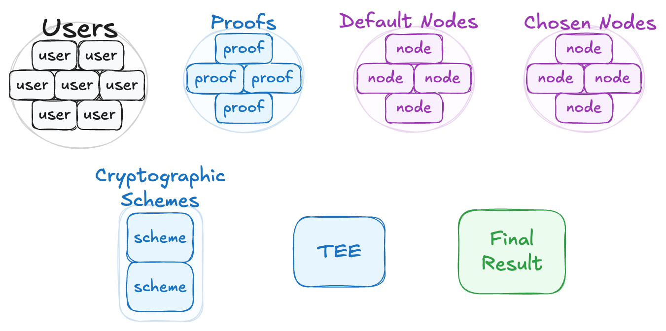
After we figure out which components are in the system, we want to understand the relationships between all of them.
After spending some more time, we find out the following:
Users act as provers and complete joint computations via cryptographic schemes.
All user attempts are recorded for transparency.
Users commit to a specific value before a node is chosen.
Nodes generate proofs for user ownership.
Nodes also perform random sampling of the MPC network and choose nodes to perform a computation.
Chosen nodes are run in a TEE to prevent cheating; dishonest nodes are slashed.
After the computation, nodes sign the result, which a third party can verify.
Looking at these seven points, it's clear how the main parts connect, giving us a solid foundation for understanding what zkTLS is.
Synthesis
Synthesis is the process of combining separate parts into a coherent whole.
Here, you'll use what you've learned to reconstruct what you initially broke down. We took the system apart into its components, and now it's time to put it back together. Before you do, however, be as skeptical as possible.
To gain a deeper understanding of your subject, challenge yourself with questions as you research.
For example: "Does this component really have this relationship with this other one? Does it also have relationships with another component? Does this step happen first, or does that one?"
In the end, you should have something that looks like this:

That seems like a big jump from the beginning. We only had seven components and ended up with a whole complex system. However, there are only two types of objects here: components and the relationships between them.
“But what about visualizations? It looks pretty cool, clean, well-positioned, and easy to understand.”
Yes, and that’s what the next section is about.
It includes 11 subsections on how to properly work with Excalidraw, starting from the styling itself and ending with how to correctly export or save it locally. So, let’s transition into that.
Visualization
Besides linking all the components together, visualizing the system is really important. Even if your diagram's flow is correct, it may look so chaotic that it's not understandable.
The 2 flows above are identical in content: the only difference is in their visualization and presentation. This demonstrates how important correct positioning and style choices are.
We'll cover figures, figure styles, text usage, arrows, opacity, layering, external images, themes, backgrounds, hotkeys, positioning, local saving, and exporting.
This is a complete guide to ensure your diagrams not only reflect the core flow but also look good. Let's get started.
1. Figures
There are mainly 3 different figures you can choose from: rectangles (squares), diamonds, and circles.
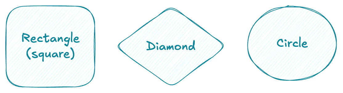
Rectangles and squares are good for almost everything. The text is positioned well, it's readable, and the overall look is clean.
Diamonds are very situational, text doesn't fit well in them and they can sometimes be disproportionate, but they do work.
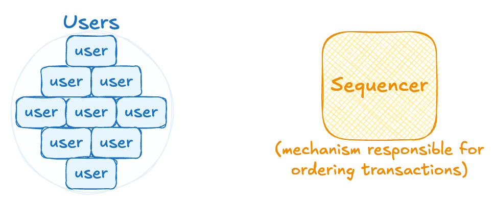
Circles are usually worse than rectangles but much better than diamonds. They are especially useful for showing something plural, or when you're fitting several objects inside a single shape.
You can also combine multiple figures to create new ones. Here are some new figures that we came up with:
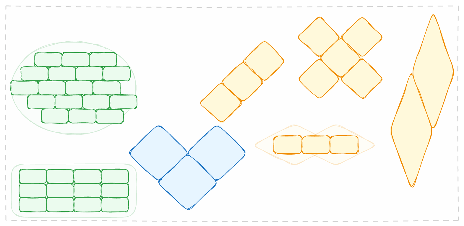
Different figures can be used for different purposes within a system. You can use circles to show relationships in a low-level architecture while using rectangles for a high-level one. You can do whatever you want with them, and you're not limited.
However, an even more important feature is how you style those geometric shapes.
2. Style of Figures
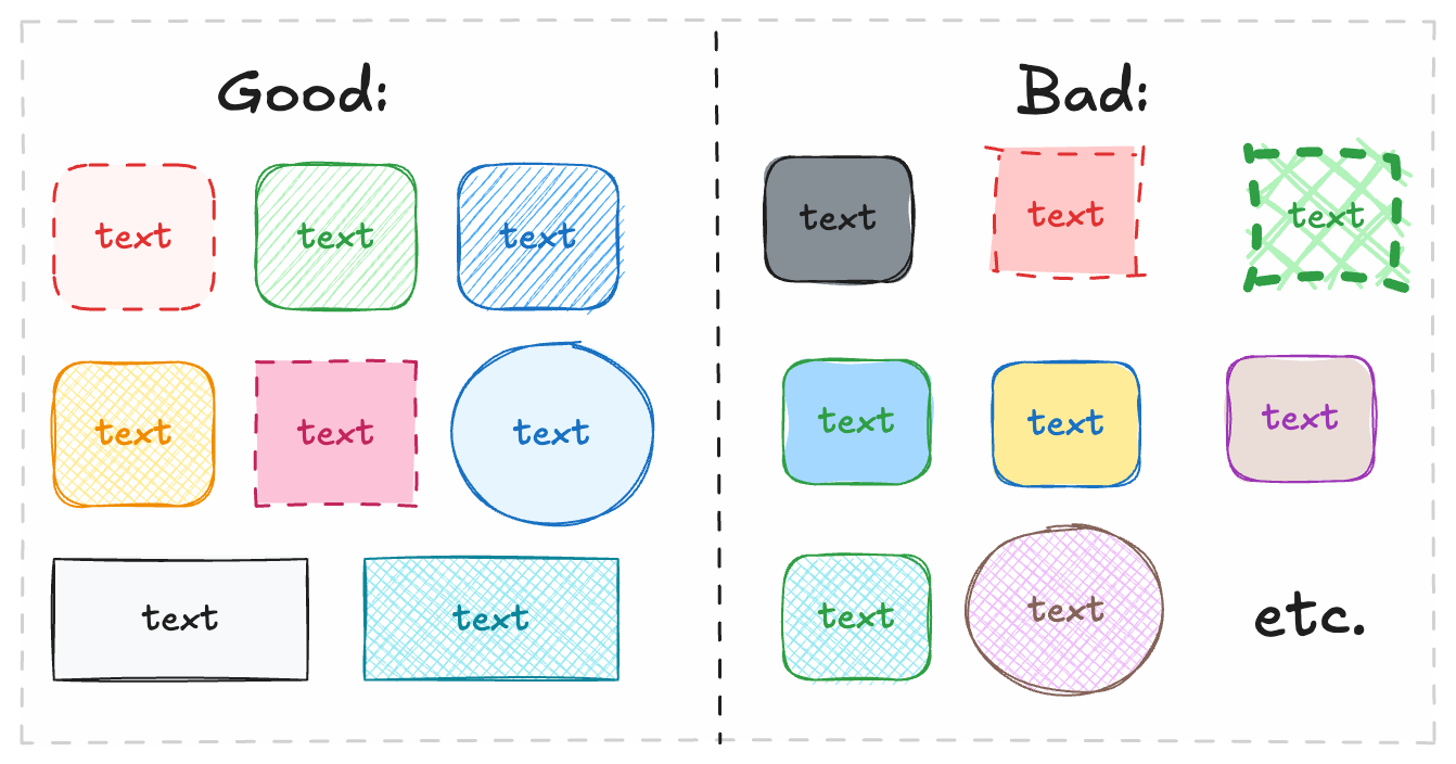
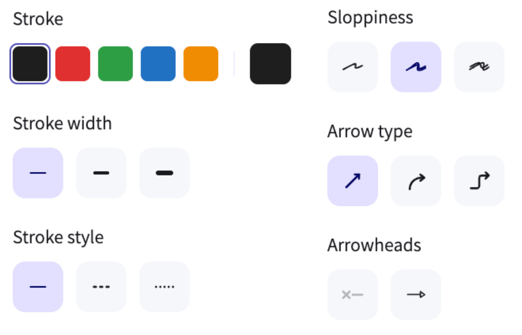
For styling, you can customize different parameters, such as strokes (color, width, and style), backgrounds, and fills.
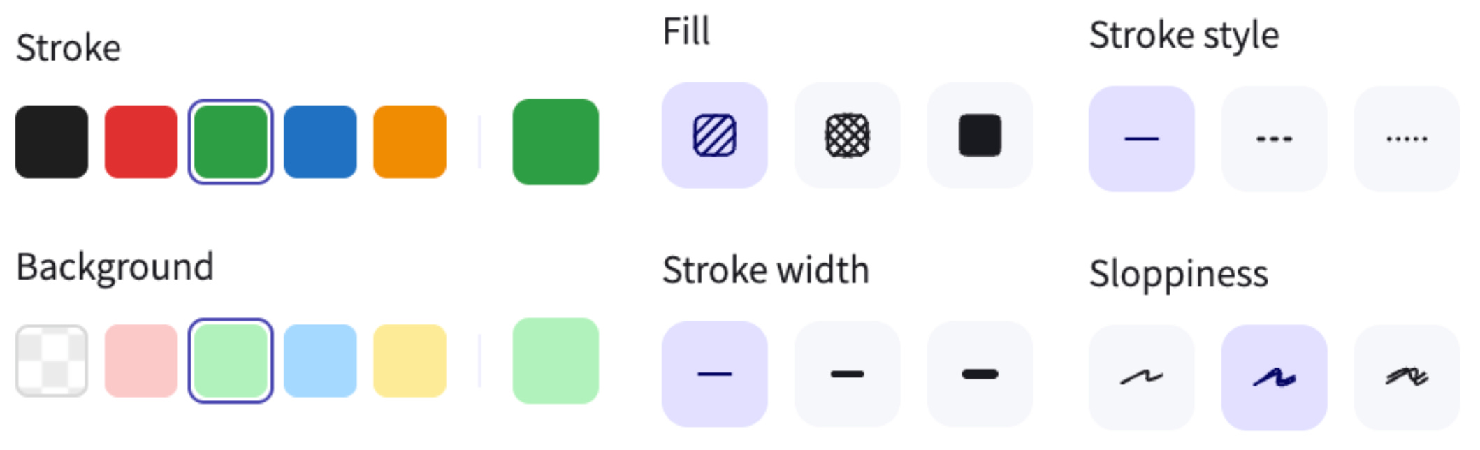
Strokes
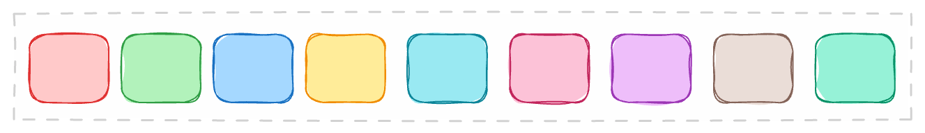
For strokes, it's important to keep in mind that the shade of the stroke should always be darker than the shade of the background. You can use any color you'd like and even add your own custom ones.
Backgrounds
Next, you can choose a background for your figure.
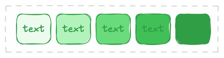
Our advice is never to go past shade 3 if you plan to have text on your figure.
Additionally, the shade of the background should always be lighter than the shade of the stroke, otherwise it looks pretty dirty.
Additional Parameters
Then, there are a bunch of other parameters you can experiment with: stroke width, stroke style, sloppiness, and edges. We're not going to describe each of them separately.
However, we'll provide some examples of what looks good and what looks bad so you can avoid common mistakes.
We briefly mentioned working with text and text boxes, so let's shift to that now, especially since it has a lot to do with the figures themselves.
3. Text Usage
This is a very important topic, as each line of text on the diagram must be readable, so there are multiple rules you should follow.
Always write text within the figures
We've seen many cases where people create figures and text boxes separately, then place the text box inside the figure. This doesn't look good or clean.
Make sure you double-click on the figure and write the text directly into it.

You can also write titles for figures if they contain multiple elements. Titles should be one font size larger than the text inside. Additionally, you can add a description in brackets outside of the diagram.
Font Sizes
There are four main font sizes: S, M, L, and XL.
Always use S for small objects and for text on arrows.
Use M occasionally, for various reasons.
Always use L for subtitles and text on large objects.
Always use XL for titles.
You can also create custom font sizes by dragging the text size. Use this option wisely, as having different font sizes all over the place can make the diagram look disorganized. Based on our experience, we recommend using custom fonts only for big titles.
4. Arrows
There are multiple options to choose from for arrows. They are usually used to show the flow and relationships between objects.
Let's go through each parameter.
Stroke: Try to use the same color that most of your diagram contains, although we usually stick with black (if your canvas is white) or white (if your canvas is black).
Width: Try to always use the smallest width. Bigger widths look ugly in most cases, unless you have a specific concept in mind.
Style: We recommend going with the default style and the dotted style (the second option). The third option usually doesn't look like an arrow.
Sloppiness: The first option is a straight line, the second is a handwritten line, and the third is a handwritten line by a five-year-old.
Arrowheads: There are multiple options you can choose from. There's no single recommendation here; just know what you're looking for.
Try avoiding extremely curved lines, as they usually mess up the flow and make the diagram look messy. However, in some cases, like when showing a swirl, they can look very good.
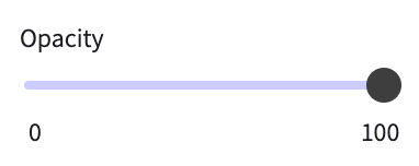
5. Opacity & Layering
We decided to include opacity and layers in the same category because they literally depend on each other. To change opacity, click on any object and you'll find this setting at the bottom left of the screen:
Let's take a look at all the cases where you should minimize opacity.
Minimizing Opacity
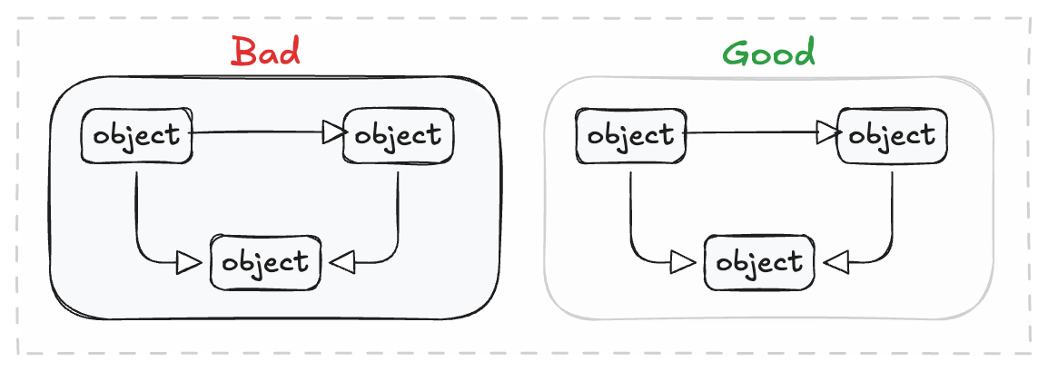
You can minimize opacity if you want to add a barely visible external frame and highlight that objects belong to that particular frame. See the example below.
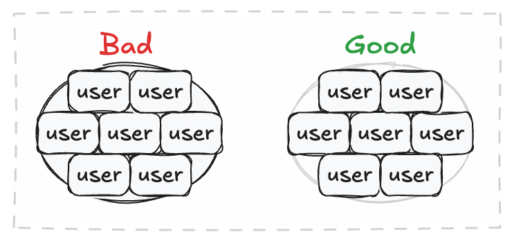
You can minimize opacity if you're layering multiple objects on top of each other, which is particularly useful for showing a plural form. See the example below.
Layers
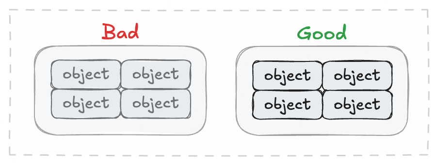
When you're changing opacity or layering objects on top of each other, you want to make sure they're layered correctly.
Usually, objects with less opacity should be in the first layer, while fully colored objects should be in the last layer.
You can configure the layers by clicking on an object and changing its layering.
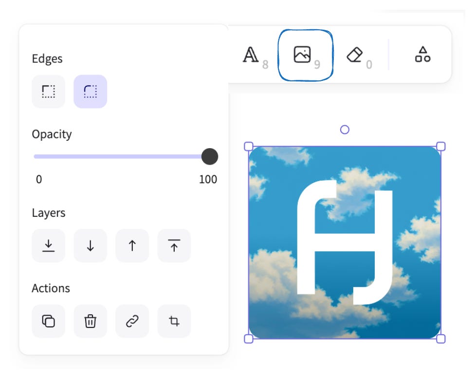
6. External Images
You can upload external images to your canvas using the image button or by copying them from another page. The only customizable features are opacity and edges. Most of the time, rounded edges look nicer, so you should choose those.
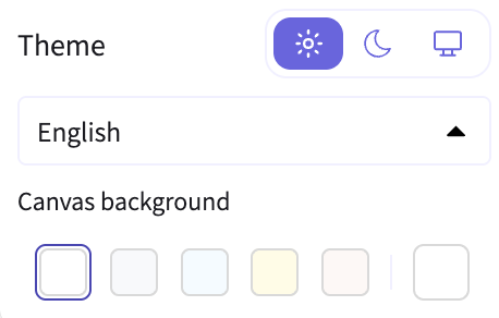
7. Themes & Backgrounds
You can also change the themes and backgrounds of the canvas.
Most people use a white theme and white background because it's easier to integrate their diagrams with most platforms' white backgrounds.
You can also experiment with a black theme or other backgrounds, but you should ensure they fit the overall style of the article or blog where you're publishing them to enhance their presentation.
There are no restrictions, so if you feel that something would pair better with a yellow or blue canvas, go for it!
Instructions:
Click the top-left button.
Change the theme if you want.
Change the canvas if you want.

8. Positioning
There are some general rules to follow when it comes to positioning. When we talk about positioning, we're referring to the final layout of your diagram.
Ensure your diagram looks good on a PC screen (16:9 ratio), unless a specific format is required.
Also, make sure it's not too wide or too narrow, as this makes it harder to read on most screens.
Here's how to ensure your flow, style, and positioning are correct:
First, create the diagram itself and connect all the components. Don't pay attention to positioning or how it looks on a screen yet. Focus entirely on the relationships between your components.
Once the diagram is complete, move the objects around to make sure it looks clean and is easy to understand. The key is to change the positioning but keep the structure the same.
The process is simple: first, you figure out how the components relate to each other, and then you move them across the screen while maintaining that core structure.
This ensures your diagram is both accurate and visually appealing.
9. Exporting
If you've reached this stage, it means you've created something good, so congratulations! Now, it's important to export the outcome correctly instead of just taking a screenshot. This ensures your diagram is saved in the highest quality possible.
When you're finished with your diagram, you can export it in two ways: exporting the whole canvas or exporting just a part of it.
If you want to export the entire canvas, simply click the top-left button and then select "Export image".
To export only a portion of the canvas, first select the area you want to export. Then, click the top-left button and choose "Export image".
Export settings
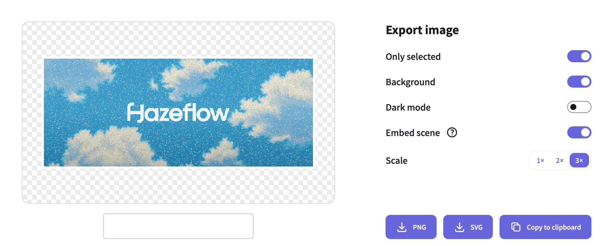
If you don’t select "background," your image will be transparent.
You can select "dark mode" if you want your diagram to render in alternative colors.
If you select "Embed Scene," you will be able to access the source diagram directly from the rendered image.
The "Scale" parameter is responsible for the image's quality and size; the higher the value, the better.
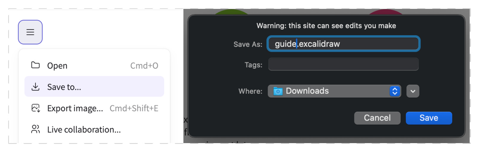
10. Local Saving
When you've finished exporting your diagram or haven't finished yet, you can save your .excalidraw file locally. This ensures it's always accessible for editing, especially if you're working on multiple diagrams at once. Saving the file allows you to restore your previous work.
Click the button in the top-left corner.
Select "Save to...".
Click "Save to disk".
Give your file a proper name and save it.
Conclusion
We have put multiple years of experience into this guide, designing countless diagrams for ourselves and the teams we work with. We deeply believe this will be useful for anyone who wants to clearly explain their system design, mechanism design, infrastructure flow, or general concepts.
Thank you for reading, and let's translate this world into human language!
Hazeflow is a educational blockchain research firm with experience in research, analytics, and the creation of technical, product, and educational materials.
We work with blockchain teams (especially complex-tech ones) who struggle to clearly and meaningfully explain their complex product.